
The Air Emissions in My Community web tool presents data from the 2013, 2008 and 2003 Air Emissions Inventories in a variety of interactive chart views via an easy to use interface. The data can be presented for different geographical areas, ranging from the entire NSW Greater Metropolitan Region (PDF 210KB) down to postcode level. Emissions of 17 substances from emission sources grouped into 63 activities are included.
Using the web tool
The web tool contains 4 interactive chart views
- Human versus natural emissions - compare emissions of multiple substances from natural and human-made sources.
- Top emission activities - list the major sources of emissions of 1 substance.
- Sector emission trends - investigate monthly variation in emissions of 1 substance in any inventory year or the trends in annual total emissions between inventory years.
- Geographic comparison - compare emissions of multiple substances in different locations.
The data for the 2013 Air Emissions Inventory is displayed by default, but the 2008 and 2003 data can be selected via the menu.
To select inventory year, substances, geographical areas, sectors and units click on the menu icon as shown in Figure 1.
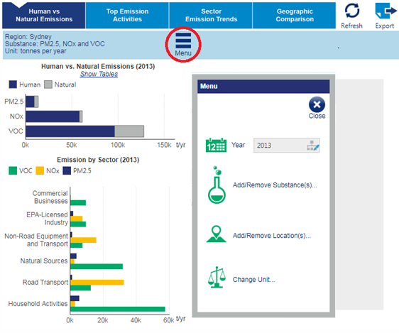
Figure 1: Web tool menu selections
In most views, additional information (for instance percentage contribution to the total emissions) is displayed when the mouse cursor is positioned over the bars or pie slices as shown in Figure 2.
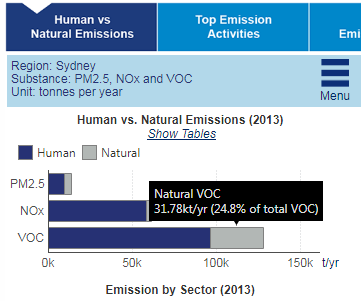
Figure 2: Web tool hover over information
Whenever the mouse pointer changes to a hand, a function or action is available by left mouse clicking that item.
Web tool fact sheets
Fact sheets and information on substances, geographical areas, sectors and activities, and emission units, and frequently asked questions are available below
- Substances (PDF 615KB)
- Geographical areas (PDF 523KB)
- Sectors and activities (PDF 186KB)
- Emission units (PDF 188KB)
- Frequently asked questions
Web tool database
The tables comprising the web tool database may be downloaded below